Fass Selections
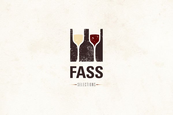
Approved Logo
Approved Logo
Who is Lyle Fass?
“Most of his background is in retail buying for Crush, Chambers Street Wines and The Wine Shop in Manhattan. Before he arrived in NYC he learned the ropes of retail in Boston at The Wine Press, Brookline Liquor Mart and The Wine Bottega. His blog Rockss and Fruit has a loyal, devoted readership and has been featured numerous times in the paper of record, the New York Times. His palate leans towards German Rieslings, the Loire, Burgundy, Austria and some Rhone plus many backwood appelation French Wines.” (New York Cork Report, 2009)
Solve was recently hired to create the logo for Lyle’s new wine venture called “Fass Selections.” The brief that was provided by Lyle was that his last name, Fass, means “barrel” in German and it would make sense to introduce this element within the solution. Similarly, Lyle wanted the proposal to have an element of surprise. He phrased it as “Escher-esque.” By this he meant that he wanted the viewer to discover different layers of meaning within the solution.
The Solution
The approved version of this logo represents two wine glasses filled with both a red and a white wine within the negative space of three wine bottles. Solve applied an old texture within the solution to provide the sensation of tradition and legacy within winemaking. Gestalt principles of psychology like “reification” and “closure” played an important role in this solution.
Sketch of the Solution
Other Proposals
Unused Proposal 1
A standard wine barrel is made of 33 staves and in this logo proposal we decided to introduce two 3’s within the negative space of the custom designed letter “S.” In the same manner, Solve decided to apply a typeface that was reminiscent of Art Nouveau because this time period is considered by many to be the golden age of winemaking. Finally we introduced the staves within “Fass” to provide texture within the solution and to visually communicate that “Fass” means “barrel.”
Sketch
Unused Proposal 2
In the above solution Solve utilized the negative space within the letter “F” to denote the silhouette of a tilted wine bottle. Similarly we applied an oak texture to correlate “Fass” with “barrel.”
Sketch


