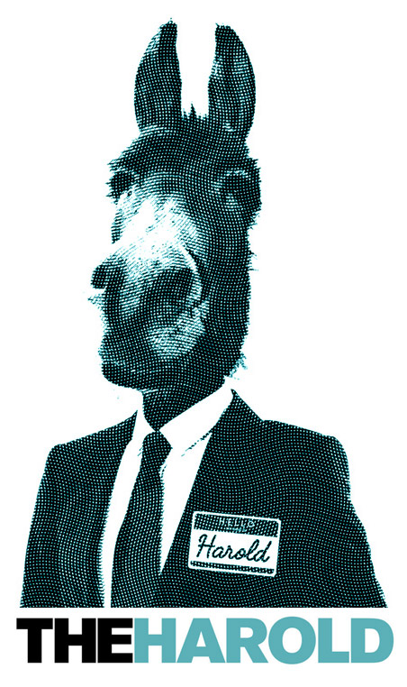
What makes something interesting to look at? In a word, contrast. I like to refer to it as “big and small.” Any time you want to create visual interest, just think about contrast.
Obviously taking my “big and small” literally can do the trick, but thinking about the opposite of something is another way to reveal something new and interesting. What this approach does is give the viewer something to think about. Our brains quickly say, “Hey, that can’t be right!” and we find ourselves investigating further.
As it relates simply to design, we could talk about color, or using a great combination of a serif typeface with a sans serif. Maybe you do have some contrasting imagery, like seen above that will pull the viewer into the scene. Sometimes, if you find yourself in a creative slump, and the answer to a particular problem is hiding from you. Use the big and small. Ask yourself, “what is the opposite of this?” Explore that idea.
Let’s say you are working with an ice cream manufacturer. You can’t seem to get into the creative zone. Your marketing ideas, graphic design concepts and the like are due soon. You are screaming at your brain to produce something interesting — and yet you can’t get the image of a scoop of ice cream on an ice cream cone out of your head. You are stuck in Obvious-ville. You are better than that. BE better than that.
So what’s the opposite of a scoop of ice cream on a cone? Who typically doesn’t eat ice cream? If ice cream is cold, what happens if it’s hot? If cones are typically made of waffer or waffle (or whatever), what would be dramatically different than that? While your answers may or may not provide you with an idea that solves the question for a particular brief, they are sure to get your mind going.
So, what’s my big and small idea for the ice cream manufacturer? Maybe a pasture full of Eskimo cows eating ice cream off the ground. Or maybe it’s the devil who gets more and more frustrated because he wants this ice cream so bad, but can’t have it. How would I know? I’ve only spent 15 seconds thinking about contrast and came up with some hair-brained ideas off the top of my head. But you can appreciate that I’m quickly led down a path away from the obvious to something substantially more interesting.
What if your problem is more about graphic design and less about concept? Same theory applies. Let’s say you are designing a poster for a client. You have the following copy to work with: 1) We sell the best apples in town. 2) Our website is bestapplesintown.com.
What about a problem that isn’t conceptual — where maybe just an interesting design is requested? Just to demonstrate, I’m going to reduce this down to the ridiculous. This exercise took me almost four minutes. Is it the solution? Of course not, but it is a starting point to get your mind flowing.
Now, please don’t believe these to be examples of exceptional graphic design. The idea is simply to illustrate how the big and small will immediately (and with almost no effort) create a more engaging environment. Given that the designs aren’t very considerate, it almost makes the point for me. The big and small, even though no real thinking has been applied, still begs that you give it a bit more attention. If I were to add orange peel texture to the huge “a,” it would simply cause a riot. But viewers would likely take notice, right?
That is essence of the “big and small.” It can serve to create design that commands more attention, and it can help to force your mind to venture away from the obvious.


